PulseMedia
A UI/UX Case Study
November 2022
By: Molly Cox
Project Overview
Background:
A startup company launched a media product two years ago. It is a freemium model that has a mobile-web experience and a mobile app for both iOS and Android. The company’s business strategy was to first build a user base by offering a free product and then evolve the feature set so they could monetize on a premium (paid) product.
Solution & Goals:
The solution was to create a mobile experience that will allow users to subscribe and pay a monthly fee for the media product.
1. Create the opportunity for new users to subscribe to the premium product upon registration in the signup flow.
2. Create the opportunity for returning free users to become paid subscribers in the sign-in flow as well as within the product (once logged in).
My Responsibilities:
Tools:
UX Researcher & Designer.
Figma.
Similar Solutions & Project Theme
Who else is in this space solving similar problems?
I started off by studying some of the industry leaders in a similar space to see how they are addressing free to paid services. I looked at companies such as YoutubeTV, Pandora, and Spotify. During this process I took note of what I liked and disliked for analysis later on.
Theme:
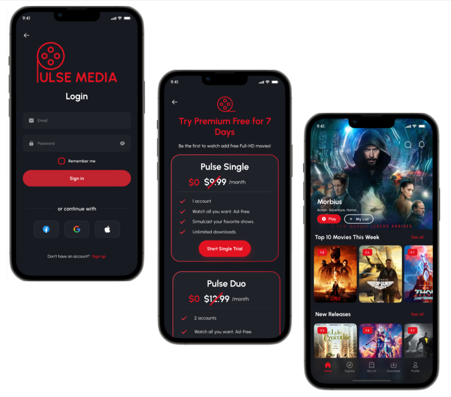
I chose to center my project around a movie streaming service. This service offers the opportunity to create a free account or jump immediately into a paid subscription if they’re interested in the additional features that come with a paid plan. This service also prompts existing users to sign up for paid services after they log in, and prompts existing users to upgrade to paid services after watching 15 minutes of a movie. I chose to challenge myself by creating the app in dark mode because that is something I have not had the opportunity to do yet. My color palette consists of reds and charcoal grays with white font.
Primary color: #181A20
Secondary color: #E21221
Font name: Urbanist
Project Plan
Project Plan:
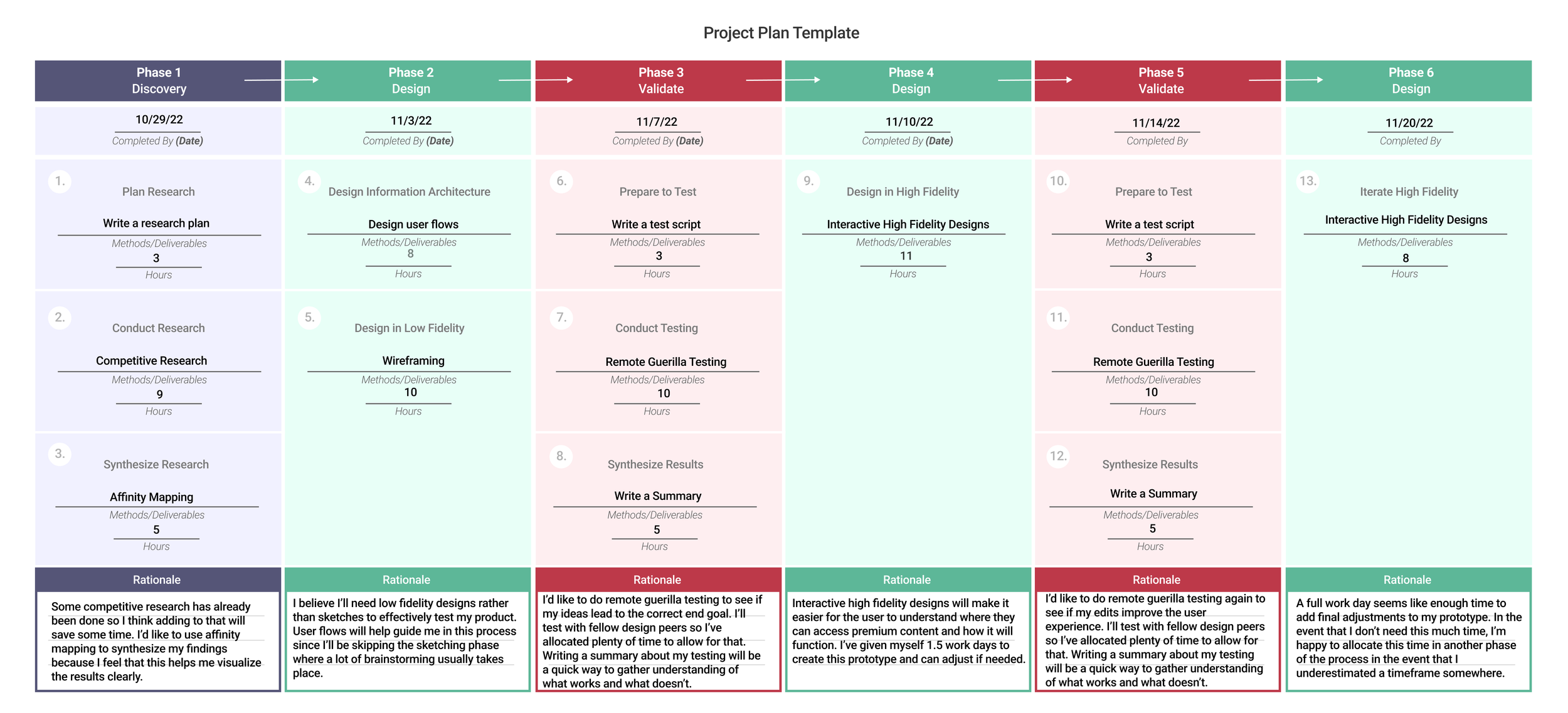
Now that I had a good understanding of the problem and how others are tackling it, it was time to come up with a game plan to help me stay organized. This plan also helped keep me accountable so that I met my deadline and turned in deliverables on time. My project plan consists of 6 phases: Discovery, Design, Validate (test), Design (iterate on original), Validate (test again), and Design (final product).
Phase 1 - Discovery
Research Plan
Research Questions:I began by curating a few research questions that I’d like to answer while doing my research. These questions helped me stay on task and now get lost while testing with participants.
1. When signing up for a new service, do you typically sign up for said services right away or later on?
2. What streaming features are important to you?
3. How long do you typically use a free service before subscribing for a fee?
Methodologies:I planned to conduct 5 user interviews to understand pain points around subscribing to premium features, and then conduct 5 usability tests afterwards. To be sure I was speaking to the correct audience, I sent out a survey beforehand to help me find participants that matched my intended audience. In the survey I asked users to indicate whether or not they’d be willing to participate in additional interviews.
Audience:- 18-24 years old
- Very tech-savvy | they are on their phones for several hours a day
- Very budget conscious
- This type of media movies is a very important part of their lives
Competitive Analysis
How are the pros doing it?I started off by doing some competitor analysis to learn more about how some of the media industry’s leaders are organizing their free to paid offerings. I studied sites like Youtube TV, Spotify, and Pandora. This process involved going through the flow of free to premium to see how the paid service was advertised, and I also took note of the complexity of signing up for paid services. I organized my likes, dislikes, and things I plan to action into word clouds to help me visualize a common theme.
I made sense of these word clouds by identifying overarching themes to implements in my project via affinity mapping. These themes are Organization, Visual Details, Things to Avoid, and Miscellaneous.
Phase 2 - Design
User Flows:
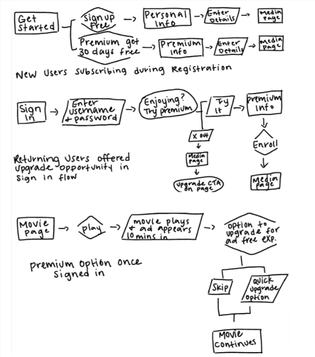
With my goals in mind, I set out to create three user flows to accomplish each one.
1
2
3
Design:
Next I set out to bring my user flows to life with a set of wireframe designs created in Figma. These wireframes will allow me to have a visual that I can use for user testing to see if my user flows and current ideas make sense.
Below are the wireframes for user flow 1:
New user subscribes during registration.
Click HERE to view wireframes as prototypes.
Phase 3 - Validate
Testing:
During this phase I tested my wireframes with 5 individuals and gathered some feedback that I could use to improve my app. I learned a lot about how users prefer to interact with paid vs free services that helped me better understand what to offer and how to present it so that I’m not overwhelming my users.
I asked participants to complete three tasks and to speak out loud as much as possible during the session so I understood the whys behind what they were doing and thinking. Depending on their approach, I may or may not ask some of the follow up questions.
To begin, we’ll assume you’re a first time user who just discovered a movie streaming app.
Create a new account (as either a free or premium user).
a. What are your thoughts about the sign up flow in relation to the Premium options?
b. Can you go back and try the other sign up option?Now that you have an account, I’d like for you to sign into your account and talk me through what you’re seeing
a. What do you think about the upgrade to premium prompt?
b. If you didn’t upgrade the first go around - please go back and do so now.
c. What are your thoughts on the flow?For the last task, I’d like you to watch the first movie and talk to me about the upgrade option you see.
I took extensive notes during my interviews and reviewed everything afterwards to see if there were any themes or major flaws within my app that need to be adjusted, The good news is that all participants were able to complete each task, and the feedback I received did not include anything critical.
Results:
Notes from User Tests:
None of the users struggled to complete any of the tasks
All users said they like to use the base product before paying for premium features
All users want clearer details indicating what premium includes/costs
One important takeaway is that free trials are more appealing than jumping into paid services
Xing out of pop ups seems to be normal behavior - if a user wants premium they prefer to seek it out and sign up on their own time
Suggestions for premium features: simulcast, early access to content, bloopers/exclusive content
Findings:
Findings (ranked most to least important - critical, major, minor, normal). These are the things I plan to implement in my next iteration of the app.
Getting new users to sign up for premium is difficult, change this to a free trial instead of jumping directly into a paid subscription (minor).
Navigation bar is not locked in place while scrolling (minor).
Lacks clear descriptions/prices for premium pop ups (normal).
Phase 4 - Design
High Fidelity Designs:
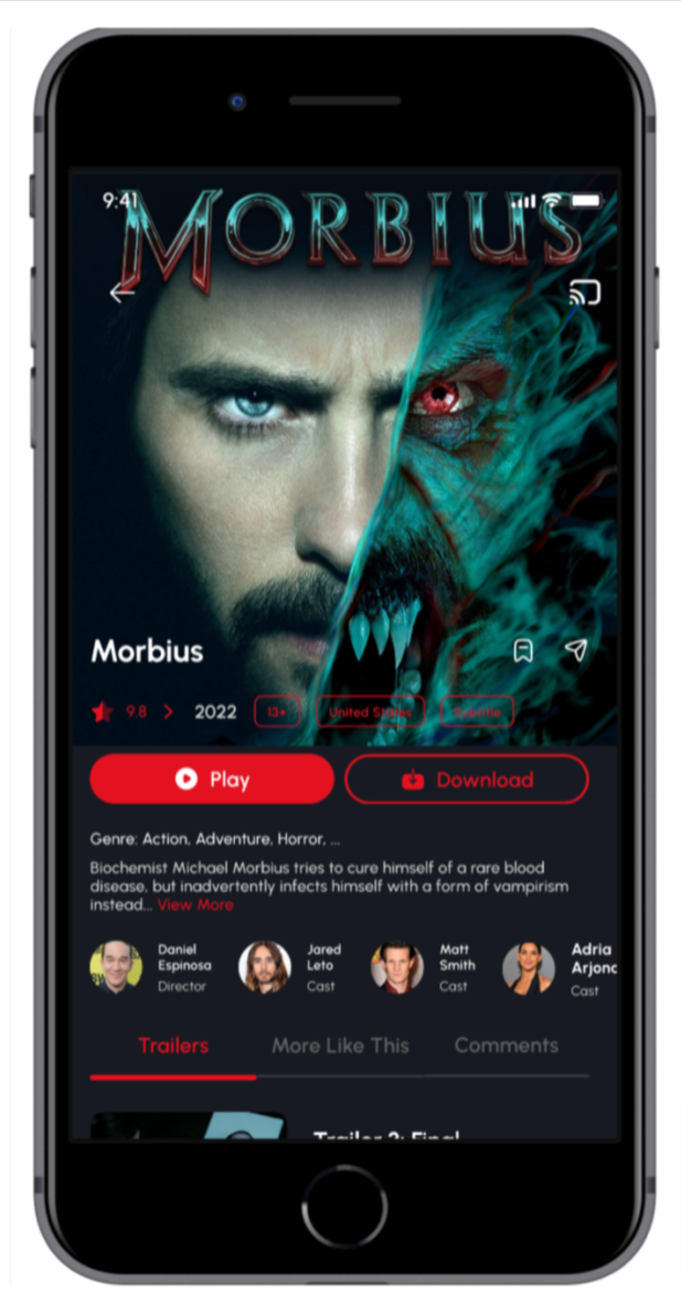
This is where the rubber meets the road! It’s time to flesh out my wireframes by adding colors, graphics, images, etc. I believe that this phase is one of the most rewarding steps in the design process because this is when ideas and doodles come to life in a realistic mock up. I enjoyed challenging myself by working in dark mode, aesthetically it was out of my comfort zone but I’m proud of the finished product.
Phase 5 - Validate
Testing Round Two:
I made some changes based on the recommendations I received after my first round of testing, and this second round of testing is to help me determine if there is anything else that needs adjusting, Based on my experience, I feel comfortable that my designs are ready for production when the feedback I receive is mainly cosmetic or based on someone’s preferences.
I used the same questions and formatting from my first round of testing (see phase 3 above) and received some really great feedback on how to improve the functionality of my prototype. These were user errors that I made in Figma rather than issues with my prototype, but I was grateful for the feedback and definitely plan to implement it in my final designs.
Recommendations:
Remove pre-selected payment options in all flows
Adjust splash screen to improve readability
Add fix scroll to the “terms” pages
Adjust delay for auto-load pages
Notes from User Tests:
None of the users struggled to complete any of the tasks
A few users complimented the UI saying that it looked very polished and professional
The feedback I received was mostly about ways to improve the prototype functionality rather than the app design
Phase 6 - Final Designs
Final Designs & Thoughts:
I made the recommended changes to my Figma prototype settings and it made a huge difference in making my prototype feel more professional. Overall, I’m proud of this project and I’m looking forward to revisiting the app in the future and adding more functionality.
Click HERE to view high fidelity designs.

